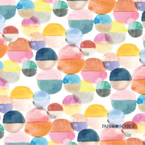
New! Free digital downloads for dressing your favorite tech accessories are here. Our exclusive Paper Source design for August featuring watercolor rainbows to wash over you for a fresh start.
New! Free digital downloads for dressing your favorite tech accessories are here. Our exclusive Paper Source design for August featuring watercolor rainbows to wash over you for a fresh start.
Gray Malin is an internationally renowned fine art photographer whose work combines the spirit of travel, adventure, luxury and artistry. Learn more and get an inside look behind the brand with our exclusive Meet the Maker interview.

Before returning to spend another summer interning at Paper Source, I spent 5 months reading maps, roaming markets, picnicking at parks, hiking trails, eating feasts, absorbing culture and speaking French. Studying abroad is an experience unlike any other. You are afforded the opportunity to delve deep into a new culture and learn through unconventional means outside of a classroom setting. My wonderful French host parents continuously spoke the words profitez-bien, directly translated as profit well but more commonly understood as make the most of it, or embrace life. This simple phrase soon developed as a reoccurring theme of my travels that I’ve come to embrace.
 We recently noticed that many PS bloggers list their favorite PS colors as Persimmon & Paper Bag. It’s true! These new colors have quickly found their way into many of our craft projects & product designs. Persimmon, bold, happy and bright, tempered by the earthiness of Paper Bag. It’s a cheerful, down-to-earth combination.
Inspired by the suggestion, I headed to our new Southport store and soon found myself with the beginnings of a card-making idea…Persimmon folded cards, Paper Bag business cards, Paper Bag envelopes and Lokta paper to line the envelopes. Hoping to find the rest of my materials in my paper scrap box (full disclosure: closet), I headed home.
Is it wrong to collect something that wasn’t meant to be seen? No, according to me and my Paper Source work mates. A few months ago I brought in my collection of security envelopes and tacked them to my inspiration board. Each day since everyone in the Design Department has been adding to the mix! They’re really quite beautiful and detailed.

Some of the envelopes are duplicates so I made some origami with them.
Our new swatchbooks have arrived and with them our yummy new colors, peacock, persimmon, sunshine and paper bag. We’re all about color here in the Design Department, and there is a certain giddy vibe that comes over us when the new swatchbooks are ready. It’s sort of like the satisfaction of getting shiny new school supplies in the fall.

Inside you’ll find a page in every color of the PS palette, as well as handy shape and size guides for our cards, envelopes and enclosures.

They’re so useful for planning a project…even take it with you when shopping for decorations and flowers to match colors to your invitations!
–Fabra
PS colors: gravel & chocolate
Latest fave: Teflon bone folder
I’m a big fan of doing photographic research while I’m concepting a new illustration for Paper Source designs. For me, having a strong idea and concept make the designs more thoughtful, and more compelling; it should be meaningful. So for our new Marigolds Wrapping Paper, I had quite the stack of collected photos!
Created and concepted while we were working on our India inspired papers, we waited for the right summery time to release Marigolds. I tweaked our garlands with PS colors, giving the flowers a bright, lush feel – evoking pure inspiration, and not wanting the design to be literal. When you check out our new Marigolds wrap, also look for additional layers of India inspired ornaments and decorative patterns in the design…with accents of metallic gold and fuchsia no less! (my favorite parts!)
 We are just so thrilled to show off our three new colors (well, four when you include beloved Paper Bag from earlier this year!). Selecting new colors for Paper Source is a lot of fun, but a big responsibility. In order to make one new color, we have to commit to 10,000 pounds of paper. This means we need to feel really good about the color and are hopeful you will too!
Peacock is our new teal blue and it truly works well with the entire PS line. Have fun mixing and matching it within our palette – you’ll be amazed what new life it gives old favorites! Some of my favorite Peacock combinations are when paired with Beet, Chartreuse, Moss, Pool or Curry – I also love it with Persimmon.
Ask anyone who knows me—my mom, my co-workers, my old hairstylist Jojo—to describe me in three words, and he or she will inevitably use the word “colorful.” Rich colors, like rich flavors, tickle some deep joyful place inside of me. Fiery colors can warm up even the rainiest afternoon, and bright, flowery hues help remind me that soon little pink and yellow and purple blooms will be popping up all across the city, like the Paas-dipped eggs that I thought magically appeared in our family’s lawn each Easter morning.

In his book “Interaction of Color,” Josef Albers talks about his method of learning about color. He uses experimentation and observation to show how colors interact with one another sometimes in a deceiving way. This play can help you discover colors that are influencers and colors that are easily influenced. It’s common for color theory to be taught with paint, but Albers felt that paper was the better medium…and we have to agree!